Case Study
Mastercard Connect
Zero to UX for Enterprise Portal Redesign
Evaluating how users navigate a complex enterprise portal and identifying opportunities to improve search, app discovery, documentation access, and task completion.
Role
Lead UX Researcher
Team
Product, Design, and Research partners
Platform
Enterprise Web Portal
Duration
6 Weeks
Study Type
Enterprise Navigation Research
Methods
Interviews + Usability Testing
Participants
8 Users
Research Outcome
Navigation Priorities
What was happening
Mastercard Connect is an enterprise portal used by internal teams and external partners to access applications, documentation, and business tools. Prior research had flagged problems with navigation and application naming, but the team needed a clearer picture of how those problems actually played out during real use, and whether new users experienced them the same way long-time users did. This study was designed to answer that question and give the design team something they could act on.
What we needed to understand
This study built on two earlier rounds of research. In November 2020, users told us the application naming conventions were confusing, they couldn't tell what an app did just by looking at its name. Then in March 2021, we heard that people wanted search, both for documentation and for applications. Those signals were consistent enough to be worth revisiting. But we wanted to understand the depth of the problem, not just confirm it existed.
Research Questions
- How do existing users navigate the homepage compared to someone using it for the first time?
- What does the current experience feel like, what causes friction, and what do users work around?
- Do users understand what the available applications actually do?
- What would make the homepage feel more useful on arrival?
What the team wanted to achieve
- Navigation that feels intuitive, not something users have to learn over time
- Enough context on each application that users can decide whether it's relevant before clicking into it
What we learned
Three things that came up across both user groups
Quick access to resources
Existing users wanted frequently used resources one click away. Without that, they built workarounds, bookmarks, browser history, memory. New users had no workaround to fall back on.
Everyone wanted search
Both groups brought up search independently. Existing users had found ways around its absence. Proxy users expected it to be there and were noticeably slowed when it wasn't.
Application names didn't communicate anything
Users couldn't tell what an application did from its name alone. Some skipped apps entirely that would have helped them, not because they didn't want to use them, but because they didn't know what they were for.
How I approached the research
I worked with two distinct participant groups: four existing Mastercard Connect users (three internal, one external partner) with an average of 13 years of industry experience, and four proxy users from comparable enterprise platforms, Visa Online and Amazon Seller Central. Each group went through a different but complementary set of methods.
Research Decision
Existing users alone couldn't tell us what the first-time experience felt like, they'd adapted to the platform's quirks over time. Proxy users gave us a way to see the product with fresh eyes, without relying on imagination or hypotheticals. Because they came from similar enterprise platforms, their reactions were grounded in real expectations, not guesses about how something might work.
Participants
Both groups were recruited intentionally. Existing users brought accumulated knowledge of the platform, including habits, workarounds, and frustrations that had built up over time. Proxy users came in with no prior Connect experience but with genuine familiarity with comparable enterprise tools, which let us separate learned behavior from genuine usability problems.
Inclusive research consideration
The range of platform familiarity across participants, from 2 months to 23 years, meant we had to be careful not to let the most experienced voices dominate the interpretation of findings. A pain point that a veteran user had quietly adapted to might be a genuine blocker for someone newer. We analyzed the two groups separately before comparing them, specifically to preserve that distinction.
Existing Users (4)
Lead Customer Service Rep
Connect · 23 Years
Global Customer Care
Connect · 6 Years
Product Team
Connect · 10 Years
PM for Business
Connect (External) · 4 Years
Proxy Users (4)
Manager Audit
Amazon Seller Central · 3 Years
Product Manager
Visa Online · 2 Months
Fraud/Claims Specialist
Visa Online · 15 Years
Inbound Fraud Advisor
Visa Online · 4 Months
8
Users Interviewed
13
Avg. Years Experience
4
Research Methods
What we learned from testing
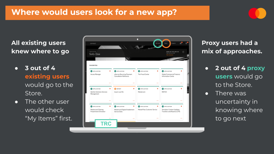
Task example: Participants were asked where they would go to find a newly recommended app. Existing users relied on learned navigation behavior, while proxy users showed more uncertainty around where to go next.
Easy Access to Frequently Used Resources
Observation
No quick and easy access to documentation
Why it mattered
Increases time on a task due to current navigation, existing users built workarounds, but newer users had nothing to fall back on
Recommendation
Allow users flexibility with accessing resources on the homepage
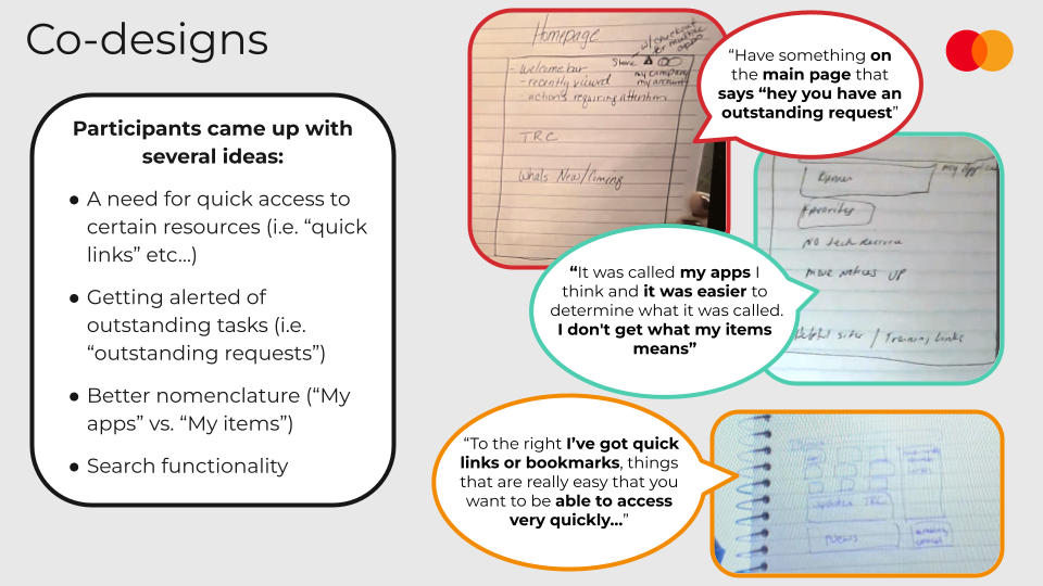
“To the right I've got quick links or bookmarks, things that are really easy that you want to be able to access very quickly...”
“Have something on the main page that says 'hey you have an outstanding request'”
Search Bar Functionality
Observation
Both groups expressed strong interest in a search bar function
Why it mattered
Existing users had found workarounds; new users would instinctively look for search and stall when it wasn't there
Recommendation
Consider a search bar function
“There's no search function on the front desk [homepage] at the moment...which I think it would be great to have search straight away.”
“Now Mastercard's competitor, VISA, they have search right at the top of their homepage which is always a great function.”
“Unless there is a search option at the navigation bar, that would be useful too.”
“I will like to see a search for the product because it is faster.”
Unclear Application Names
Observation
Application names lack descriptions regarding functionality
Why it mattered
Users skipped apps that could have improved their efficiency, not because they didn't want to use them, but because they couldn't tell what they were for
Recommendation
Consider adding short descriptions and implementing a tagging system
“It was called my apps I think and it was easier to determine what it was called. I don't get what my items means.”
Store Navigation is Overwhelming
Observation
The store has too much content and is confusing
Why it mattered
Users struggle to find and evaluate available applications, the store surface was supposed to help but was adding to the cognitive load instead
Recommendation
Add links to manual/sales material within the store journey
“I think the store has too much out there and it is too confusing.”
“Store journey: when you go in store and decide to order an app you only see a few sentences.”
Co-Design Insights
Existing users sketched their ideal homepage experience, revealing consistent themes around faster access, clearer organization, search, and proactive task alerts.
Participants Came Up With
- A need for quick access to certain resources (i.e. 'quick links')
- Getting alerted of outstanding tasks (i.e. 'outstanding requests')
- Better nomenclature ('My apps' vs. 'My items')
- Search functionality
Participant Sketches & Feedback
Recommendations
Prototype suggestions for next iteration
Tagging System
Implement a tagging system for applications to help users understand functionality at a glance and discover relevant tools.
Search Bar
Add a prominent search function on the homepage for both documentation and applications, matching competitor offerings.
Quick Links
Allow users to customize their homepage with quick access to frequently used resources, favorite apps, and documentation.
Business Impact
What changed because of this research
Validated that navigation challenges identified in previous research were still affecting users, giving the team evidence to act rather than revisit the question.
Helped the product team prioritize search, clearer application descriptions, and quick access to frequently used resources.
Influenced future homepage concepts by introducing ideas like quick links, improved labeling, and better task visibility based on what came out of the co-design sessions.
Research impact
The findings gave the design team specific direction rather than a general list of complaints. The search bar, which had been a known gap for over a year, moved from a wishlist item to a prioritized design decision backed by evidence from two different user perspectives. The co-design sessions with existing users also surfaced a quick-access pattern that directly informed how the homepage was reorganized: users wanted their most-used resources surfaced on arrival, not buried behind navigation.
Application naming became a separate track of work. Rather than a simple rename, the team began exploring short descriptions and tagging as a way to let users evaluate an app before committing to click into it.
Looking back
The most unexpected thing wasn't a finding, it was the difference in emotional tone between the two groups. Existing users talked about the platform with a kind of resigned familiarity. They knew what didn't work, they'd made peace with it, and they were cautiously hopeful. Proxy users had no such patience. Their reactions were sharper, more immediate, and in some ways more honest. That contrast made the case for proxy users as a method more clearly than any research report could have. When someone with no history with your product can't figure it out in the first five minutes, that matters, regardless of whether your long-time users have learned to work around it.