Case Study · Course Concept Prototype
Phase
Could treatment instructions be easier to follow one day at a time?
A healthcare course project where I explored how provider instructions could be organized into clear daily steps, so a patient can see what to do today and what comes next, without losing access to the original instructions.
Uses a fictional 10-day treatment plan.
Role
Concept, UX, research planning
Context
Healthcare course project
Platform
Responsive web prototype
Built with
AI-assisted prototyping in v0
Project type
Course concept prototype
Focus
Treatment instruction clarity
Status
Not launched or patient-tested
Plan generation
Simulated for the demo
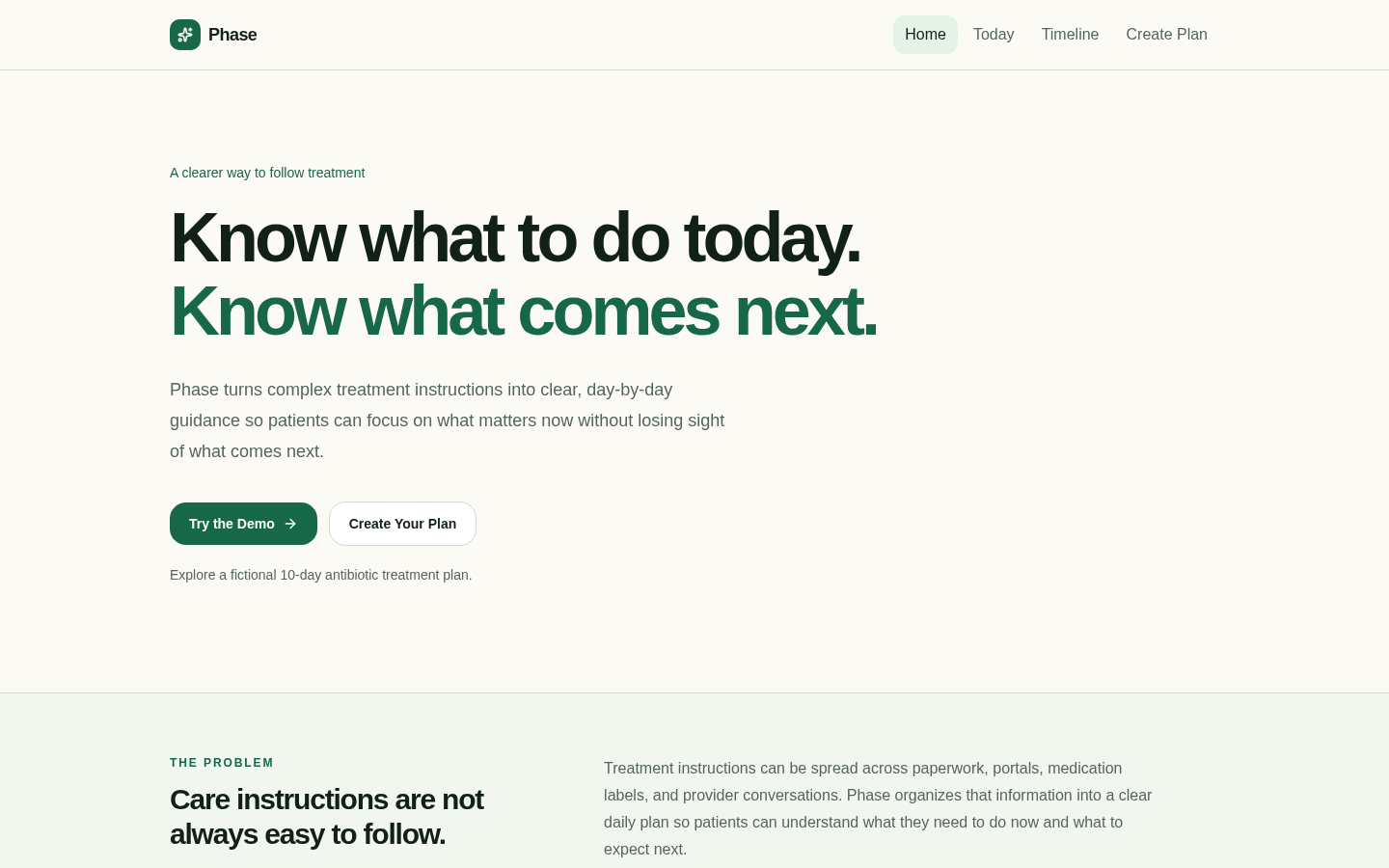
About this project
Phase is a course concept prototype. It has not been launched, tested with patients, or clinically validated. The plan generation in the prototype is simulated, and everything shown uses fictional sample instructions. This case study describes what I designed and what I would want to learn next, not research results.
The problem I explored
Treatment instructions don't usually live in one place. A patient might get part of the plan on paper, part in a portal, part on a medication label, and part in a conversation they're trying to remember later. Each source can be accurate on its own and still leave someone unsure what they're supposed to do today.
- Discharge paperwork
- Patient portals
- Medication labels
- Provider conversations
I wasn't trying to replace any of those sources or give medical advice. My question was narrower: could the instructions a patient already has be reorganized into a clearer daily view?
The concept
Phase takes existing treatment instructions and organizes them into daily actions, while keeping the original wording accessible. I set a few design intentions early so the concept stayed in its lane.
01
Organize, don't decide
Phase only restructures the instructions it's given. It doesn't create, change, or interpret medical recommendations, and the interface says so.
02
Today first
The main view focuses on the current treatment day and its actions, with what comes next visible but secondary.
03
Keep the source close
The original instructions stay one tap away on every main screen, so the organized plan can always be checked against them.
04
Be honest about progress
Progress reflects actions the patient has marked complete. The prototype labels this so it isn't mistaken for verified medication use or clinical progress.
Key screens
I built the prototype in v0 using AI-assisted prototyping, which let me move from the concept to a working flow quickly and spend more of my time on the content and structure of each screen. These are screenshots of the live prototype.
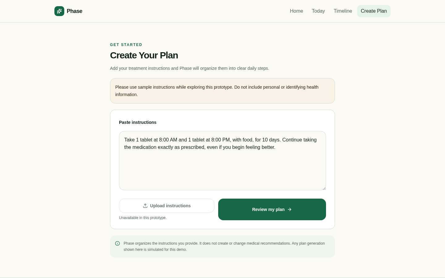
01Plan creation
Patients paste the instructions they were given. The prototype asks for sample instructions only and notes that plan generation is simulated. Upload is shown but disabled.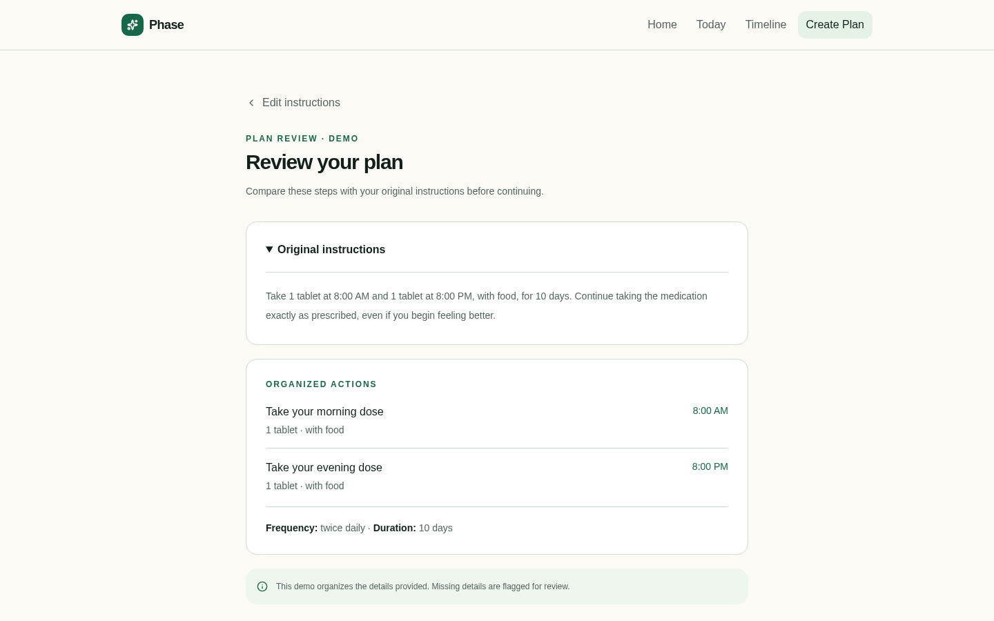
02Plan review with original instructions
Before the plan is used, the organized actions sit directly below the original instructions so the two can be compared. This is where I wanted trust to be earned, not assumed.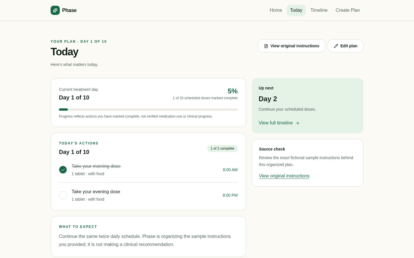
03Today, with action completion
The Today view shows the current treatment day, its actions, and what's up next. Marking an action complete updates progress, which is labeled as self-reported rather than clinical.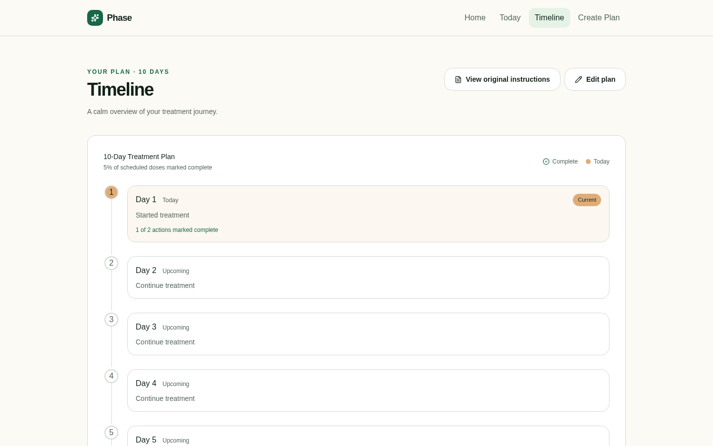
04Treatment timeline
The timeline gives a calm view of the whole plan: which day is current, what's been marked complete, and what's still ahead.What I would want to learn
I designed Phase around three research questions. They shaped the screens, but I haven't tested them yet. They're open questions, not findings.
Research questions
- 1Can patients identify their next action?
- 2Can they tell the difference between the current treatment day and the actions they've marked complete?
- 3Can they compare the organized plan with their original instructions and decide whether to trust it?
The second question is the one I'm least sure the design answers. "Day 1 of 10" and "1 of 2 complete" sit close together on the Today screen, and I can imagine someone reading progress as how far along their treatment is rather than what they've checked off.
Proposed next steps
If I continued this work, research would come before more design. These are the steps I would propose.
01
Patient and caregiver research
Talk with people who manage treatment plans for themselves or someone else, to understand where instructions actually break down and whether a daily view would help.
02
Clinician input
Bring the concept to clinicians to understand which instructions are safe to reorganize, what must stay verbatim, and where a tool like this could create risk.
03
Task-based usability testing
Run sessions with fictional treatment scenarios, asking participants to find their next action, explain their progress, and check the plan against the original instructions.
Reflection
Working with AI-assisted prototyping changed where my effort went. Getting to a working flow was fast, so most of my thinking went into the harder parts: what the product should refuse to do, how to label progress honestly, and where the original instructions needed to stay visible.
A working prototype can feel more finished than it is. Phase demonstrates a design direction. Whether it actually helps patients understand their treatment is still an open question, and answering it would take the research above.